


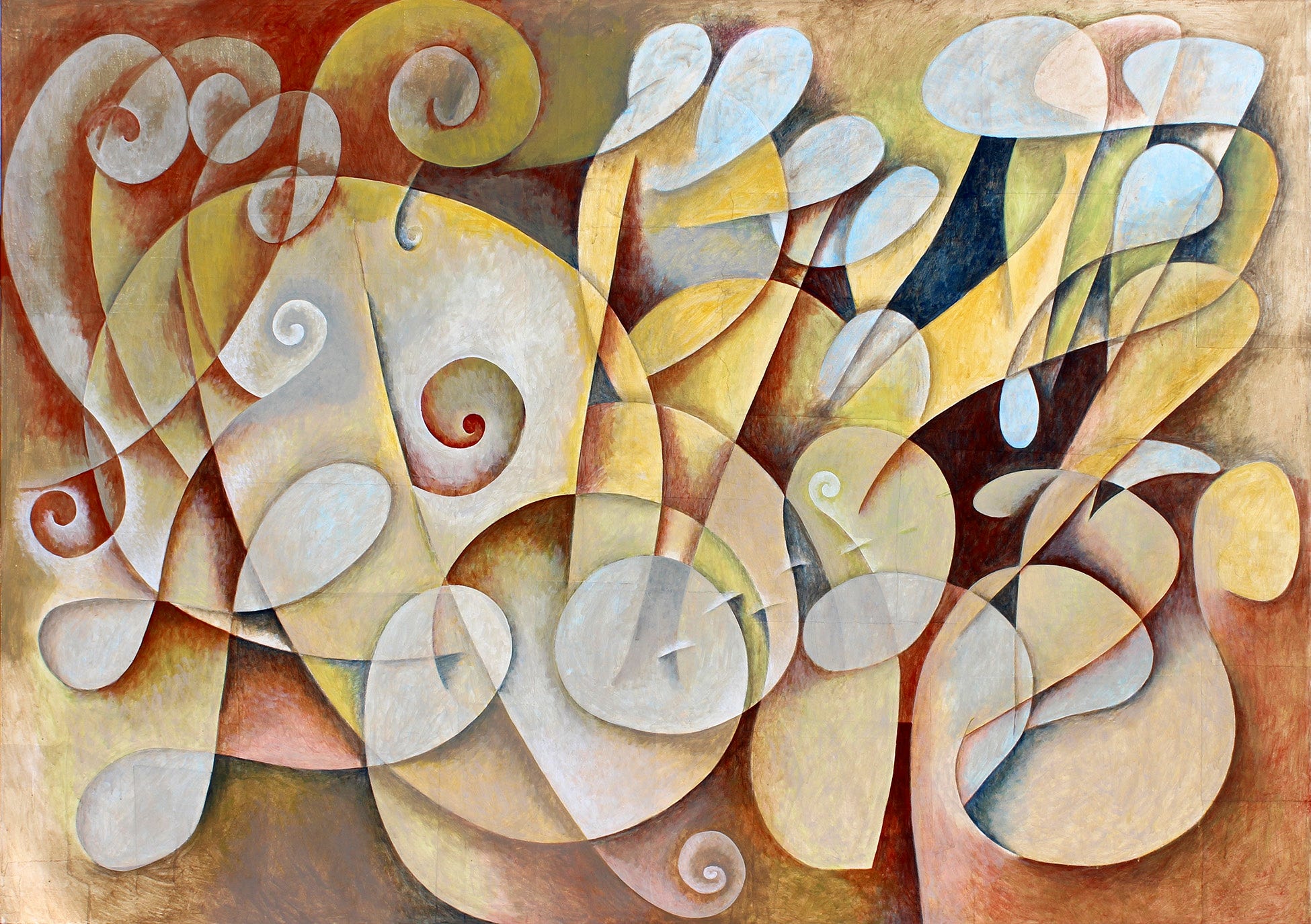
I am posting this painting again because I found the contemporaneous notes that I took after I painted over the image. Here they are with a few related sketches.
While I post about Visual Musicality experiments I want to show you the way I personally process what I am doing and what I am thinking about as I grapple with this subject.
Studio Notes
This is an experimental painting testing out some symphonic painting ideas. I started it sometime in January with the idea that it would just be an experiment to try out some ideas before covering it with a typographic painting. If I was crazy about it, I would keep it and use another canvas for the typographic painting. This is the underpainting for PDP1105CT20. The things I am testing out are primarily figuring out a way to formalize the process of making a painting of this sort. These are the test result notes.
The steps
Create a suitable base surface – in this case a paper clad surface that is smooth and easy to use any media on such as paint, drawing and possibly collage. This also includes some sort of neutral mid-toned color scheme. In this case the painting started out with a translucent glaze of more or less a raw umber color.
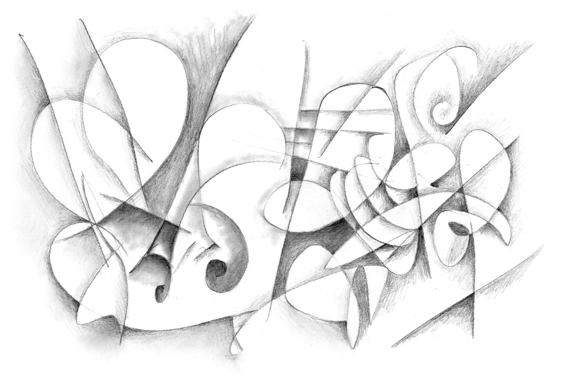
Make a line drawing – in this case I decided on a fairly sparse free hand asemic writing style gestural drawing
Edit the line drawing – I did not edit the line drawing too much in this study except to erase out lines that seemed they would create visual conflicts or edit lines that seemed to need some adjustment such as rounding out more precisely certain curves or spirals.
Pick a light and a dark color and/or warm and cool color and define the spaces between the lines.
Make additional edits or additions based on the above process.
At that point it should be ready to call it finished but I ran into a number of problems and felt like I could not see a finish line as quickly as I was hoping. My problem is that, once I get deeply involved in this kind of a painting, it can go on for years and require endless contemplation, edits and additions.
I was not clear when I started what I wanted to do for a color scheme and midway I started to decide that what I really was liking was the idea of a color scheme like a classic conte drawing such as ‘trois-crayons’ technique which is more or less what I had been doing in previous paintings and drawings of this kind but just maybe need to work on a very large scale. I don’t want these paintings to seem overly related to cubism or futurism. The umber tonal works from Analytic Cubism seem to mesh color wise with the ideas I am trying to flesh out but in the end it seems that tonal is the only way that really makes sense for these kind of paintings.
I have been struggling with the decision of how to use color in these symphonic style works and if there are any other ideas related to the use of flat forms or just stick with working out the paintings using shading techniques and focus more on light. I was trying to think of colors as a way to indicate instrumentation – a way to separate out the various interpenetrating movements of various lines weaving in and out of each other creating many different forms and spaces.
I have also been thinking about the idea of using the actual brush strokes to represent complex textures of things like the string section: violins, cellos, violas, bass etc. where musical forms are created with seemingly thousands of individual notes by the combination of many players. Maybe color can be worked out with transparent glazes at the very end or maybe developed as various under layers.
Another issue to me is that, in this painting, there are too many forms that are of more or less the same scale and proportion. That is not completely true of course but I feel there needs to be large overarching forms mid-sized forms and very small forms moving through the whole thing to give a feeling of monumentality.
Another problem in my opinion with this composition is that it does not have the kind of repetitious development of a motif that I am looking for. But one thing I am experimenting with is how to simplify the process so that I can clearly know all the stages and how to move swiftly from one phase to the next. I think it still needs to feel like a read from left to right instead of an all-over composition like this one is. Maybe the proportions of the painting need to be shorter and wider to encourage that kind of a read. Maybe 48 or 54 x 120 inches? That would be something like two 48x60 canvases or even three would be better 48 x 180 but I don’t really want the breaks in the surface is the only problem. Still, Symphonies have seams via the silence between movements. They need to be big enough that the shapes and forms can be painted easily without cramped spaces.
A thing that I do in the typographic paintings is start with a small collage study and the blow it up to a large scale. Maybe I need to work like that instead of fully developing the painting directly on the canvas…hum. That would tell me where exactly the finish line is. Maybe that is the key.
In music I have been listening to the way various composers use different levels of amplification to create softness and delicacy or strong and powerful movement in the work. Sometimes this is with increasing or decreasing the number of instruments or merely by having the players play more softly or strongly. Then certain instruments come to the foreground and slip into the background as a different set of instruments come to the foreground. This is also done by speeding up the tempo or slowing it down. The movement often goes from one set of instruments to another like from strings to woodwinds to brass maybe. All of these things can be done with painting once the painter has decided how to represent such ideas.
I could use a coffee.
Be sure to hit the like button and I really enjoy your comments.
I am so very glad you came back to this painting to explain so intensely articulately as to the hows, whats, and whys of what you're trying to accomplish in this specific goal of typographic painting. Also pleased that you photographed/catalogued the original painting before you painted over it and explained why you did as that gave me a better understanding of why you did. Your precise explanation as to the process gave me such insight to how you think/work/produce........reading and absorbing what you wrote reminded me of doing acid back when, and following each and every facet of what's involved in doing something that's important/meaningful. To use an antiquated phrase, I am blown away!; not by what you explained, but that I actually understood it as it made perfect sense to me and I didn't have to re-read portions of it again and again to "get it". You're using your entire mind to create an idea, a feeling, to do what may seem almost impossible to do without giving up in frustration. I'm not stroking your ego here but merely giving kudos in not only achieving what you need to do but doing the difficult part in explaining it to us, your readers. I'm inspired!